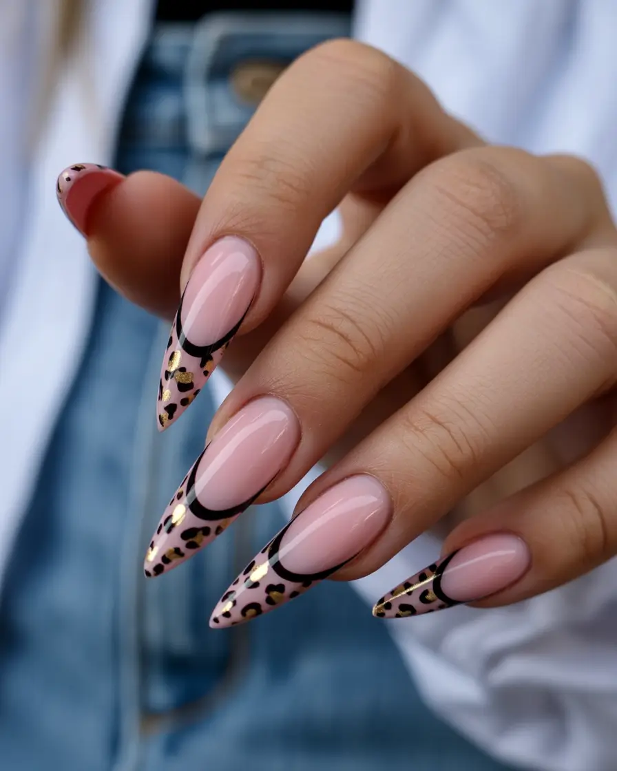
It always starts the same way for me – one random scroll, one unexpected color combo, and suddenly I’m rethinking my entire summer mood.
So let me ask you something… when was the last time your nails actually felt fun? Not just polished, not just “pretty” – but bold, a little reckless, maybe even a conversation starter at brunch?
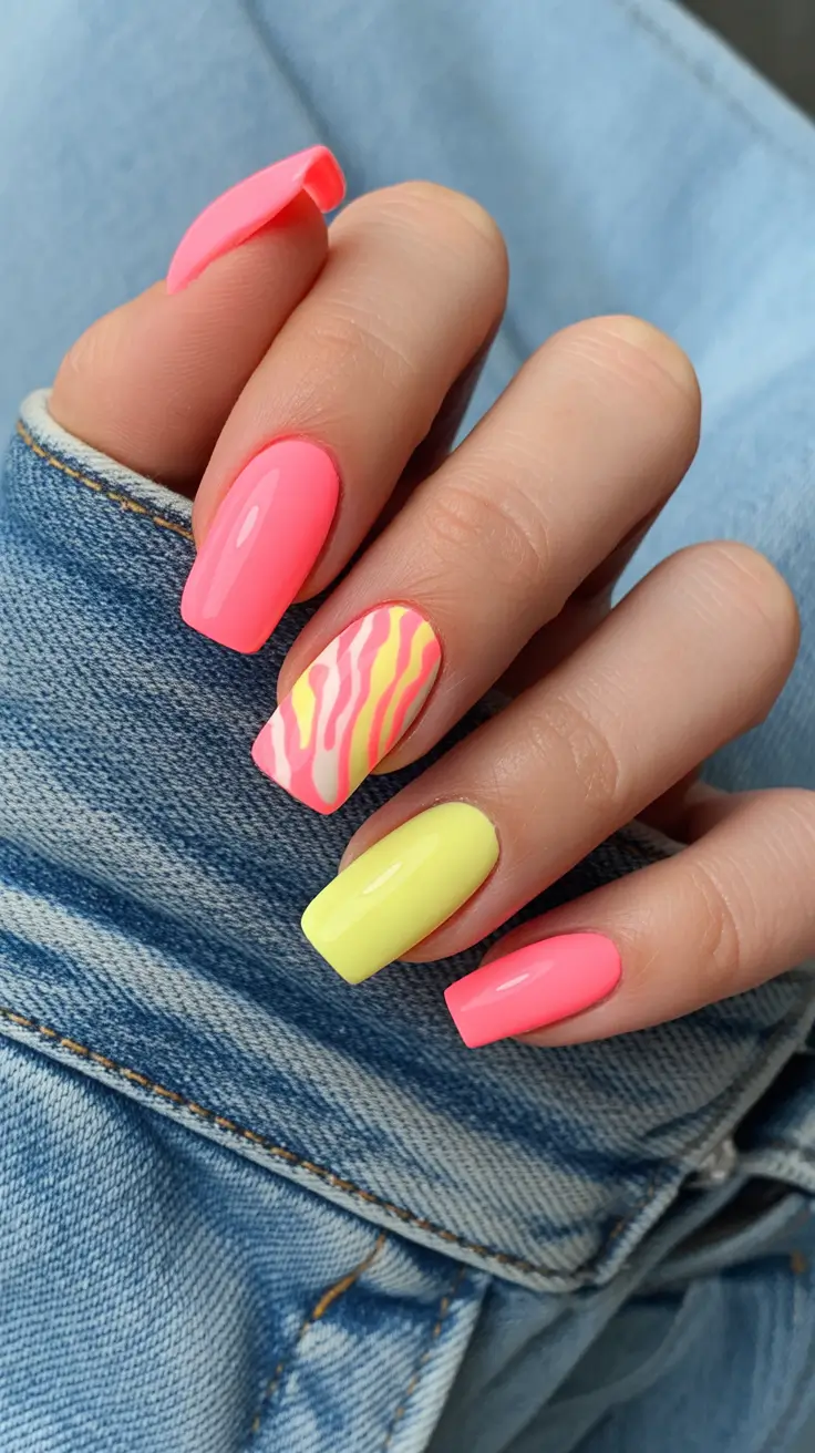
This summer, neon isn’t playing safe. It’s louder, glossier, a little nostalgic, and somehow more wearable than ever. I’ve been noticing how these Bright tones are no longer just accents – they are the look. And the best part? There’s a version of it for every comfort level.
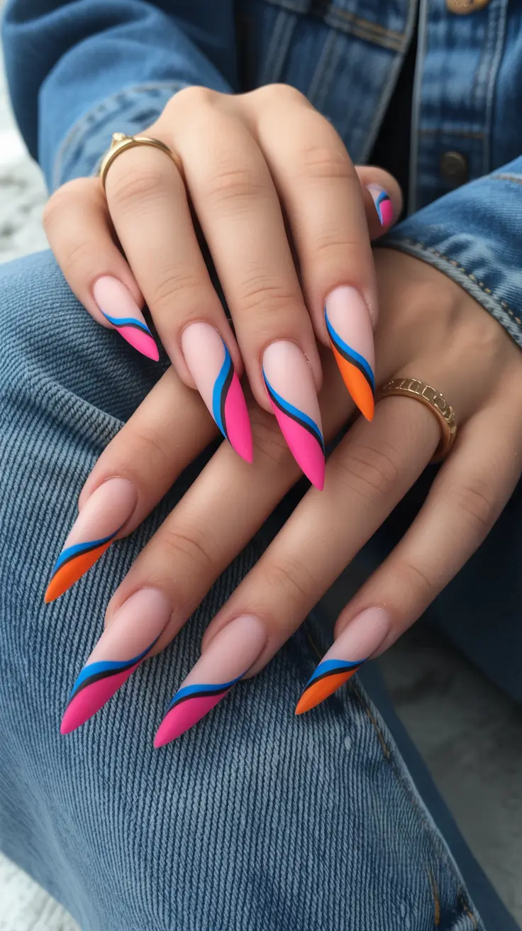
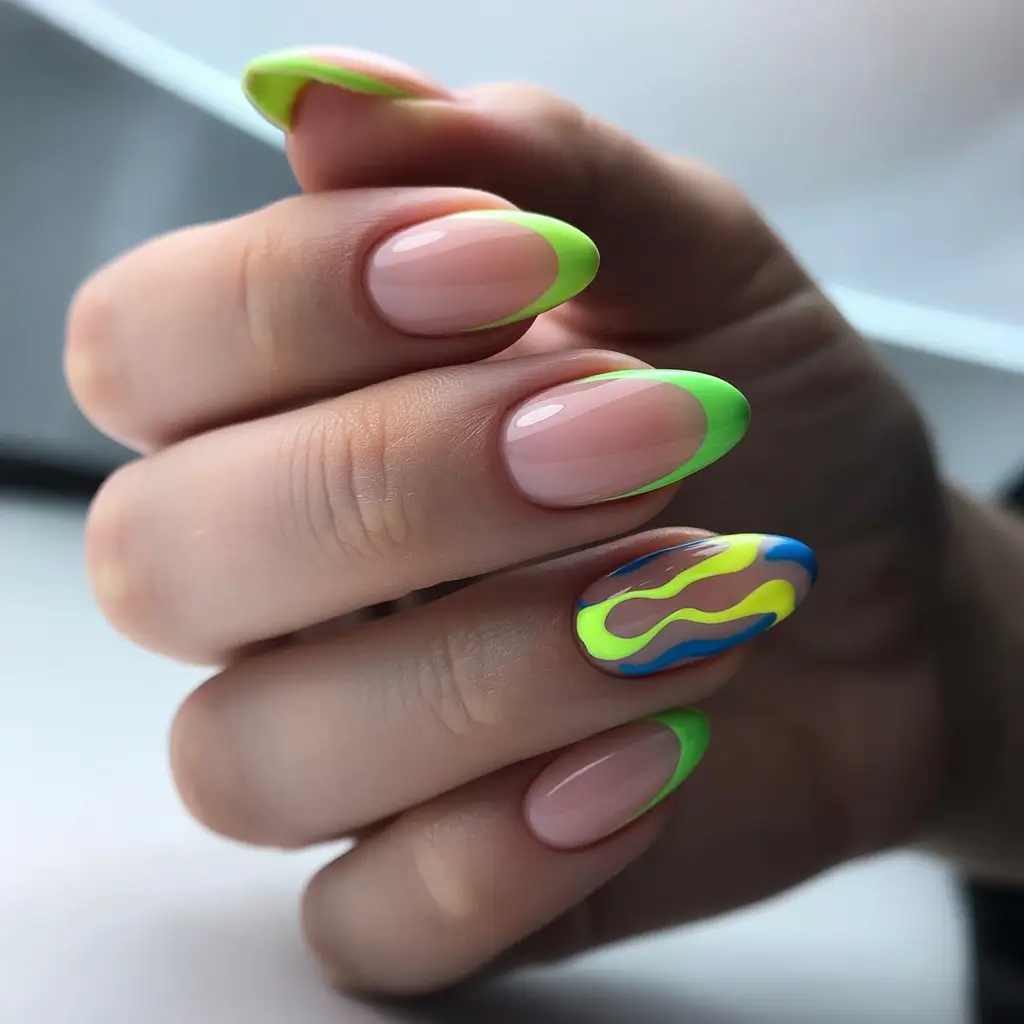
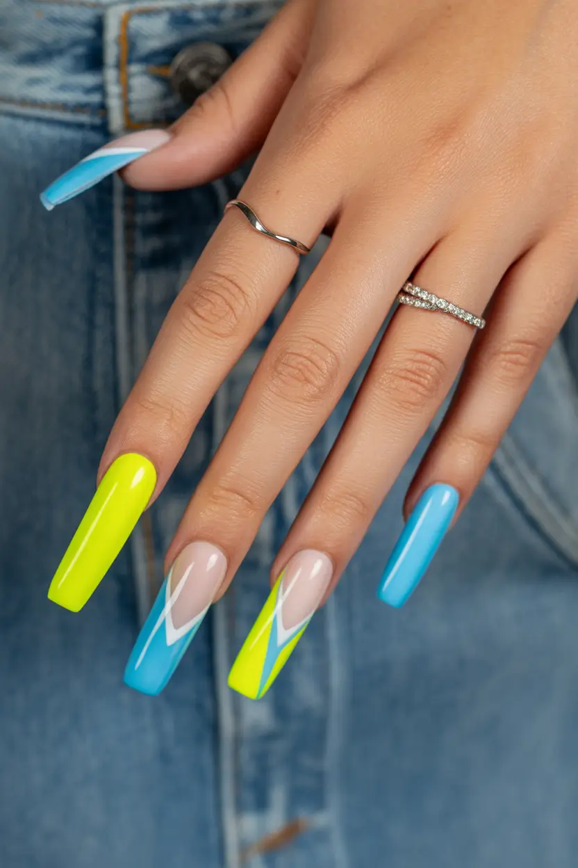
Neon clash with graphic attitude
I keep coming back to this kind of manicure when I want something unapologetically Hot but still controlled. The mix of electric Green, vivid pink, and that clean nude base creates one of those Art designs that feels both chaotic and intentional. What really pulls it together are the sharp lines and tiny Polka dots detail – it adds just enough structure so the neon doesn’t overwhelm.
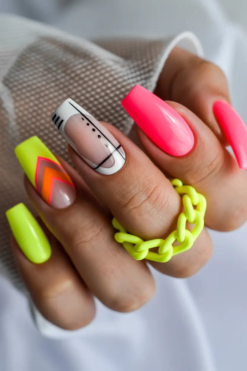
When I tried recreating something like this, I leaned on OPI’s “The Pass is Always Greener” and a neon pink from ORLY. A milky nude base like Essie “Ballet Slippers” helps balance everything. For the black detailing, I always reach for a fine liner gel – it’s the only way to get those crisp lines without losing your patience halfway through.
Technique-wise, I’ve learned to build neon in thin layers. Celebrity manicurist Betina Goldstein often says that precision matters more than complexity, and honestly, she’s right. I sketch the lines lightly first, then go in with color. It’s slower, but the result feels intentional.
And personally? This is the kind of set that gets compliments from strangers. It feels like wearing a tiny piece of modern art on your hands – and somehow, it makes even a basic outfit look styled.
Soft chrome glow with playful lettering
There’s something almost hypnotic about this finish. It’s not your typical neon – it leans into that glazed, iridescent space where colors shift between lilac, mint, and soft Coral depending on the light. Then suddenly, bold black lettering cuts through the softness, and it becomes something else entirely.
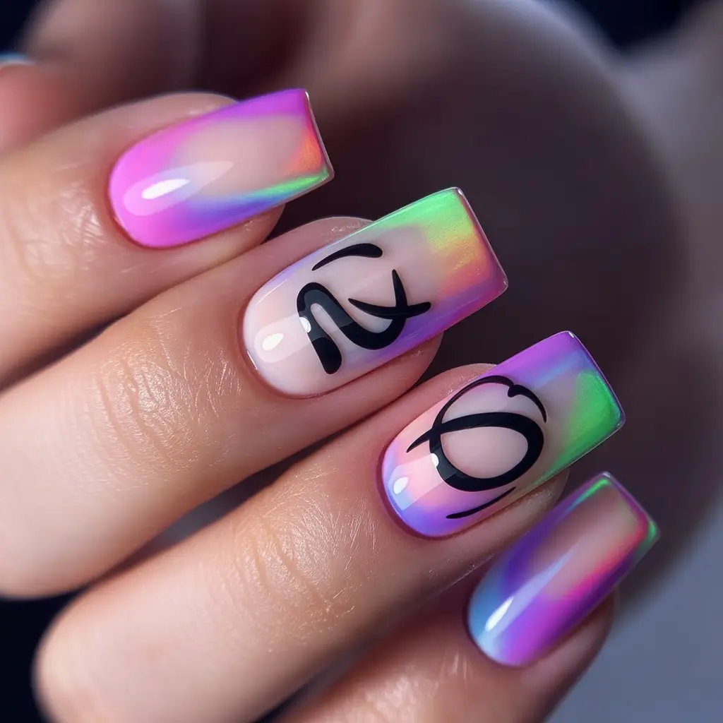
To get this effect, I usually start with a sheer builder gel base and layer chrome powders – Daily Charme and Born Pretty both have great options. The key is that glassy top coat. Without it, you lose that liquid shine that makes this look feel expensive.
What I love is how wearable it is. It’s technically neon-adjacent, but softer. If you’ve ever felt like Acrylic bright shades were too much, this is your entry point.
I wore something similar to a dinner last summer, and someone literally grabbed my hand mid-conversation to ask about it. That’s when you know it’s working.
Gradient flames in sunset tones
This is where summer really shows off. The blend of Orange, lime, and warm red melting into each other feels like a late July sunset – intense, glowing, impossible to ignore. Add those fluid white lines, and suddenly it turns into one of those Art fluo looks that feel alive.
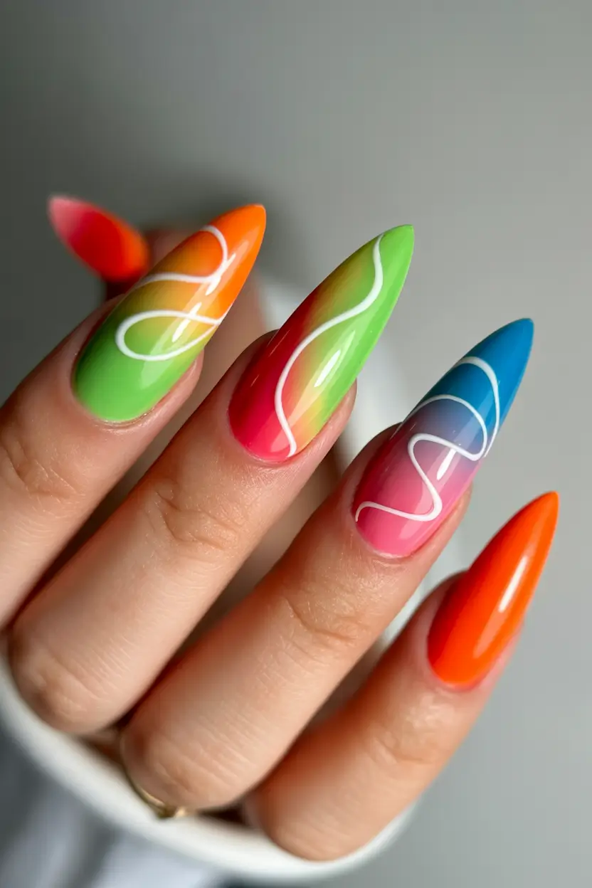
I usually sponge the gradient first using neon gels from brands like Kiara Sky or Madam Glam, then refine with a detail brush. The white lines go last – and here’s a trick I picked up from editorial nail artists: don’t overthink symmetry. The slight imperfection is what makes it feel modern.
There’s also something about longer shapes here that just makes sense. These Designs for elongated nails give you space to let the colors breathe.
I won’t lie – this set feels bold. But in that confident, vacation-energy kind of way. Like you booked the trip, even if you didn’t.
Minimal neon French with a twist
Now this – this is for the girls who want neon, but make it subtle. A clean nude base with razor-sharp French tips in acid Green feels fresh, almost sporty. Then one accent nail with fluid neon waves adds just enough personality.
I’ve done versions of this on shorter nails too, and it still works – perfect if you’re into Combos short styles that don’t require length. A nude rubber base and a neon liner gel are really all you need.
Application is surprisingly forgiving. Paint your tip first, clean up the edge with a flat brush, then go in with your accent design. According to nail pros featured in Allure, modern French is all about color play rather than precision perfection – and that mindset makes it way more fun.
Honestly, this is my go-to when I can’t decide. It’s clean, but not boring. And it grows out gracefully, which… we all appreciate.
Matte neon statement with graphic text
There’s something undeniably powerful about matte neon. This blend of lime Green and highlighter yellow feels almost electric, but the matte finish tones it down just enough to feel intentional. Add bold typography, and suddenly it becomes a statement.
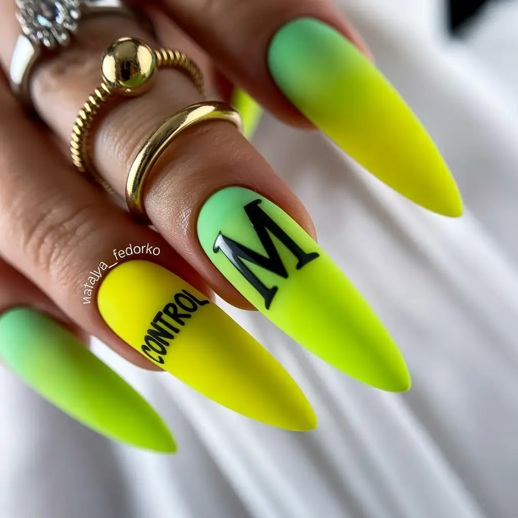
For this, I skip shine entirely and go straight for a velvet Matte top coat. Neon pigments from brands like The GelBottle Inc are perfect for that saturated payoff. The lettering can be done with stamping plates or hand-painted if you’re steady.
What I’ve noticed is how different neon feels in matte. It’s less “festival,” more editorial. Almost like something you’d see backstage at Fashion Week.
And if you’ve ever wanted nails that feel like an accessory on their own – this is it. No rings needed. Just attitude.
Tropical neon mix with playful detailing
I don’t know what it is, but this kind of manicure instantly puts me in a vacation mindset. The contrast between juicy Orange and soft neon Green feels almost like tropical fruit – fresh, slightly unexpected, and very Bright. What makes it stand out for me are the tiny illustrative details, like the bird and palm leaves, which turn it into one of those Art designs that feel personal rather than generic.
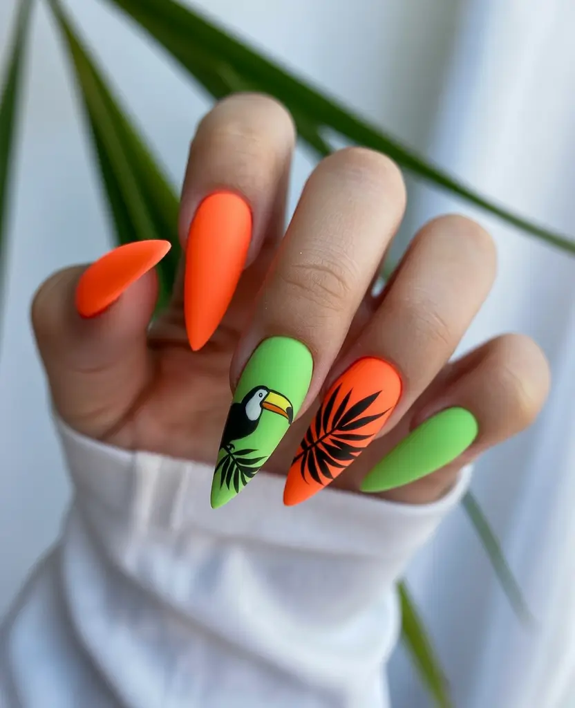
When I tried something similar, I used Gelish “Tokyo a Go Go” for that electric green and a punchy Coral-leaning orange from Bio Seaweed Gel. For the artwork, ultra-fine brushes are non-negotiable. You need that precision to keep the design clean instead of messy.
The trick here is layering – base color first, cure, then slowly build the illustration in sections. Editorial nail artists often say to treat each nail like a mini canvas, and honestly, that mindset changes everything.
And personally, I love how this set feels like a conversation starter. It’s not just color, it’s storytelling – and somehow that makes it even more fun to wear.
Glossy flame accents on bold yellow
This one leans more graphic, more attitude. A saturated yellow base paired with black flame-like tips and subtle hints of neon creates that sharp, almost edgy finish. It’s giving late summer nights, loud music, and that slightly rebellious energy I always end up craving by August.
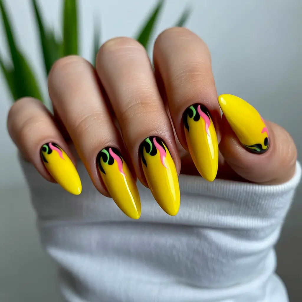
To recreate it, I usually go for a highly pigmented gel like The GelBottle “Daisy” for that rich base. The flame detailing needs a steady hand – I outline first in black, then add subtle neon touches like Pink and orange or lime for dimension.
What I’ve learned is to keep the design slightly imperfect. Flames shouldn’t look too symmetrical – that’s what makes them feel alive. Even celebrity nail artist Mei Kawajiri often embraces that “messy perfection” in her work.
For me, this is one of those Acrylic bright looks that instantly changes your mood. It’s bold, yes – but in a way that feels intentional, not overwhelming.
Playful character art in neon tones
Okay, this one made me smile immediately. There’s something nostalgic about mixing soft lilac with punchy Green, especially when one nail turns into a tiny character. It’s playful, a little quirky, and honestly… kind of refreshing in a sea of ultra-polished looks.
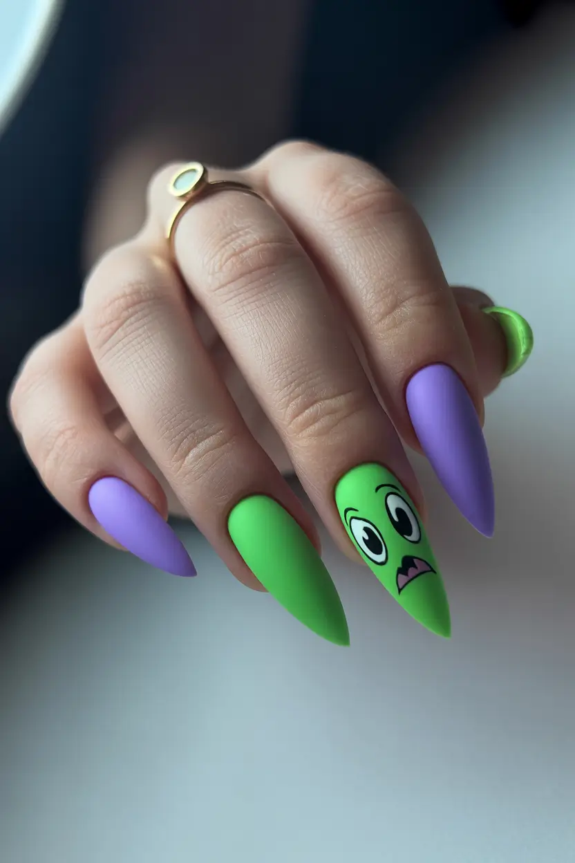
If you want to try this at home, I’d keep the base colors clean and Solid. Brands like Lights Lacquer or Olive & June have great creamy neons that don’t streak. The character detail can be done with dotting tools and a fine liner brush – it’s actually easier than it looks.
The key is contrast. A soft pastel next to a Bright neon makes everything pop more, without needing extra elements.
And honestly? This is one of my favorite Art ideas simple. It doesn’t take itself too seriously, and sometimes that’s exactly what summer beauty should feel like.
Sharp neon French in dual tones
There’s something so satisfying about a perfectly sculpted almond shape paired with ultra-clean French tips. But here, it’s not the classic white – it’s that electric mix of neon Green and yellow that feels fresh, almost futuristic.
I usually start with a builder gel to get that smooth, glossy nude base. Then I go in with a liner brush for the tips, alternating colors to create that subtle contrast. Precision matters here – clean lines are everything.
What I’ve noticed is how versatile this look is. It works for everyday, but still feels elevated. It’s one of those Designs for when you want something modern but not too loud.
I wore a version of this on a work week once, and it felt like the perfect balance – polished, but still interesting enough to catch the light (and attention).
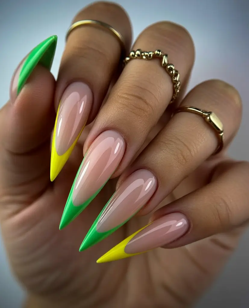
Color-pop French with neon variety
And then there’s this – the kind of manicure that feels like summer bottled into one set. Each nail gets its own neon moment: pink, yellow, green – all sitting on a soft nude base. It’s playful, but still cohesive.
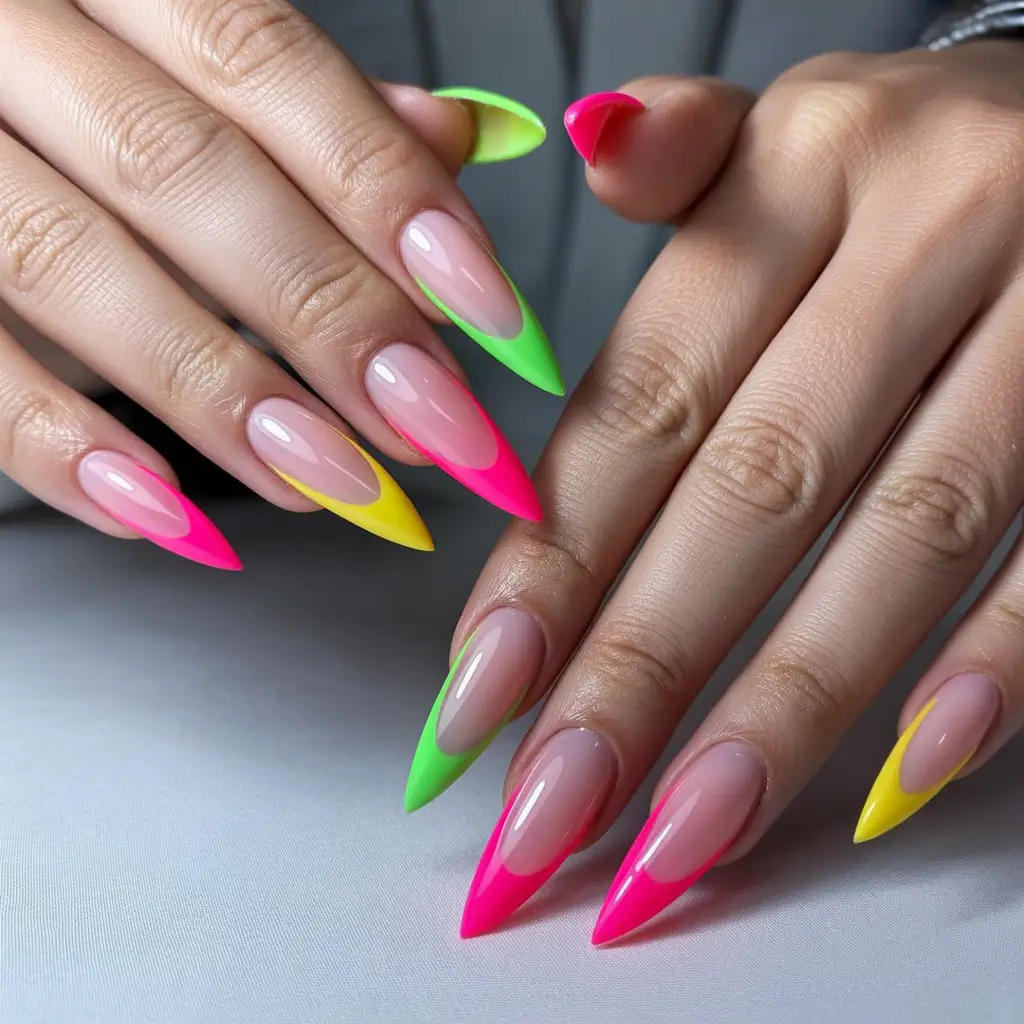
To get this look, I rotate between shades from brands like Cirque Colors and OPI Neon Collection. The base stays sheer and glossy, while the tips carry all the color.
Application is surprisingly beginner-friendly, especially if you’re exploring Art ideas short or experimenting with Combos short on slightly shorter lengths. You don’t need perfection – just consistency in shape.
And I love how adaptable this is. You can swap colors depending on your mood, your outfit, even your plans for the weekend.
Electric pink neon with sharp green outline
I’ll be honest – this is the kind of manicure that instantly makes me feel more put together, even in the middle of a chaotic week. That ultra-saturated pink base paired with a razor-thin Green outline creates a contrast that feels both clean and striking. It’s minimal in concept, but visually so Bright that it doesn’t need anything else.
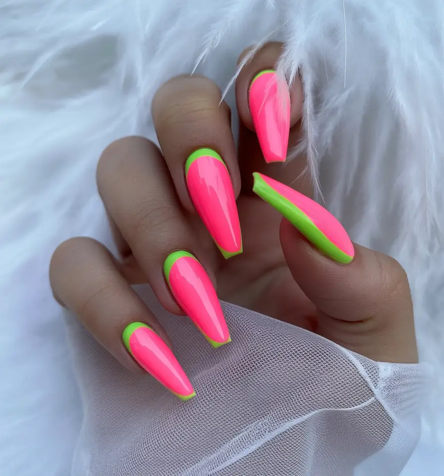
For this look, I usually reach for a high-impact neon pink like OPI “Hotter Than You Pink” and a liner gel in lime green. The secret is opacity – neon needs at least two thin layers to really show up the way you want.
Application-wise, I always paint the pink first, fully cure, and then trace the outline slowly with a detail brush. It’s one of those techniques that rewards patience. According to nail artists featured in Refinery29, clean borders are what elevate a simple idea into a statement.
And personally, I love how this works with everything. It’s bold, yes – but also oddly wearable. Like your favorite lip color, but for your hands.
Reverse neon French with deep teal contrast
This one feels unexpectedly sophisticated. A vivid pink frame combined with a deep teal center creates a contrast that’s richer, almost moodier than typical neon. It’s still playful, but in a slightly more polished, evening-ready way.
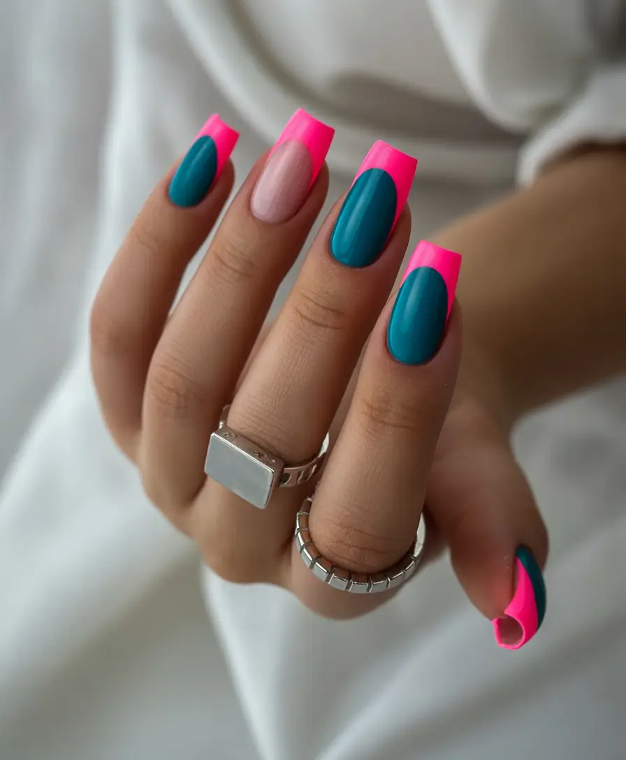
I like to think of this as a twist on French tips, just flipped and exaggerated. I usually use a rubber base for that smooth nude foundation, then block in the teal with a rounded brush before outlining with neon pink.
The key here is balance. The proportions matter – too much pink, and it overwhelms; too little, and it loses impact. Celebrity manicurist Tom Bachik often talks about “color placement” being everything, and this is exactly that.
I tried something similar for a night out once, and it felt different from the usual neon. Less beach, more rooftop dinner. And honestly, I’m into that shift.
Soft neon waves in pastel motion
This set feels like summer slowed down. Instead of high-contrast neon, it leans into softer blends – lilac, butter yellow, and gentle pink flowing together in smooth curves. It’s still Bright, but in a way that feels airy and almost calming.
To recreate this, I usually layer sheer gel colors and blend them while still slightly wet. Brands like Aprés and Bio Sculpture have amazing soft neon tones that work perfectly for this effect.
What I’ve learned is to let the brush glide naturally. Don’t force the lines – the organic flow is what makes it feel modern. These kinds of Art ideas simple don’t need perfection, just a good eye for color.
And honestly, this is the set I’d wear on a slow Sunday. Coffee, sunlight, nowhere to rush. It’s that kind of energy.
Glossy coral ombré with a soft fade
There’s something about a clean ombré that never gets old. This transition from sheer nude into glowing Coral feels effortless, like a natural extension of summer skin. It’s one of those looks that doesn’t scream for attention but still gets noticed.
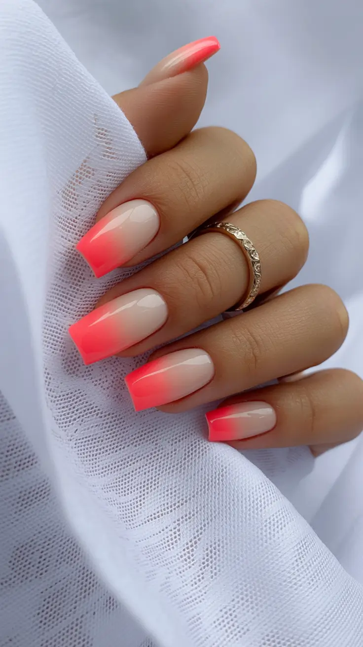
I usually use a sponge technique or a soft blending brush with gel polish. The key is building the gradient slowly – rushing it always shows.
This is also a great option if you’re transitioning from minimal styles into neon. It feels softer, more wearable. Think of it as the manicure equivalent of a tinted lip balm.
I’ve recommended this to friends who weren’t sure about neon, and every time, they end up loving it. It’s subtle, but still very much summer.
Matte orange statement with graphic lines
And then, just when things start to feel soft again, this comes in and shifts the mood completely. A bold, matte Orange base paired with sharp black lines and a single accent nail creates a look that feels graphic, almost architectural.
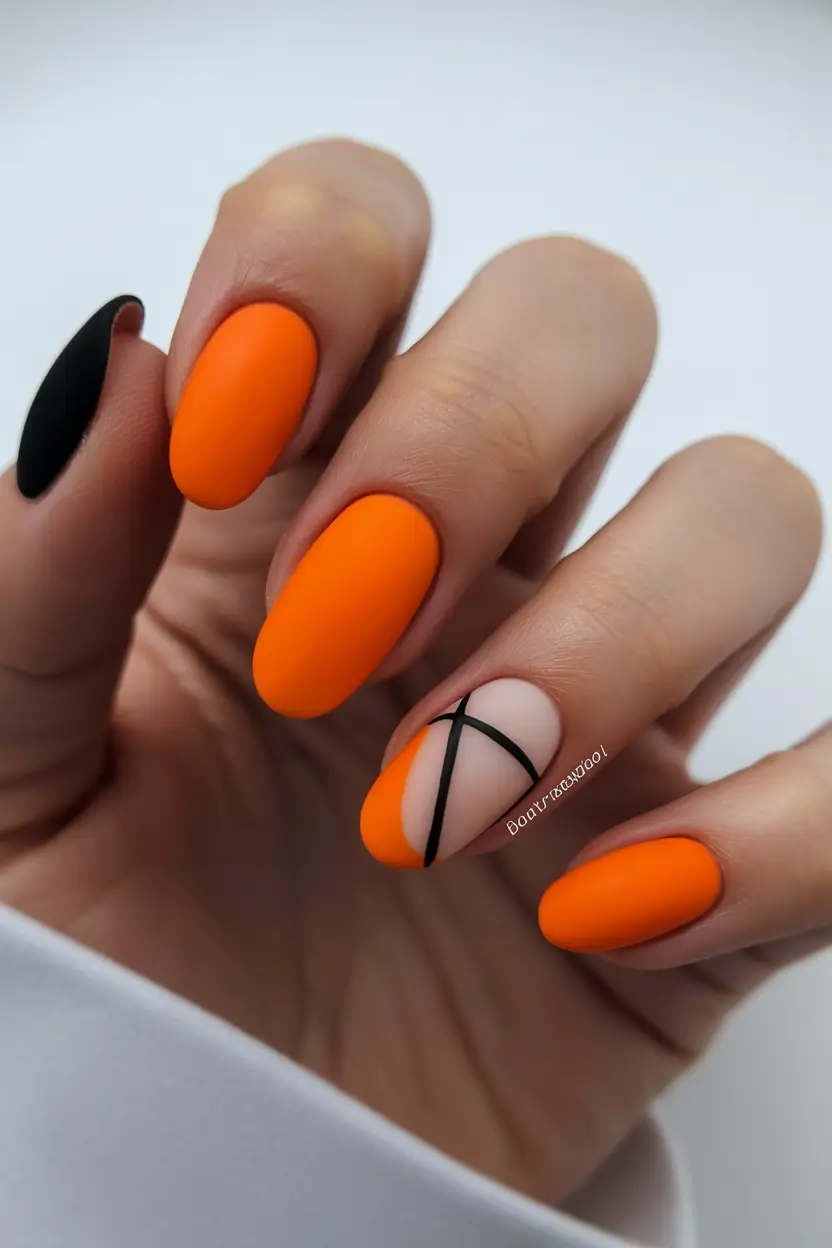
I love using a velvety Matte top coat here – it transforms the neon into something deeper, more editorial. The black detailing can be done with striping tape or a precision brush, depending on your comfort level.
What stands out is the contrast. The softness of the nude accent nail against the intensity of the orange creates that push and pull that makes great Designs memorable.
Personally, this is what I reach for when I want something strong. Not loud for the sake of it, but confident. You know that feeling when your nails just match your mood? This is exactly that.
Hot pink dragonfly accents with clean contrast
There’s something instantly uplifting about a glossy Hot pink manicure like this. It feels classic at first glance, but then those crisp white dragonfly details come in and shift everything into something more delicate, almost poetic. I love how the simplicity of the base allows the Art designs to really stand out without competing.
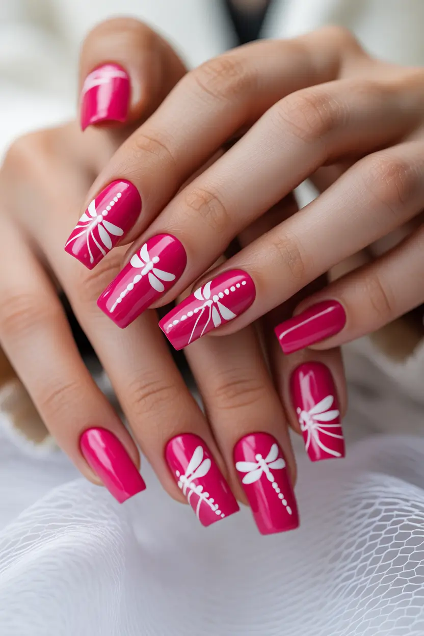
To get this effect, I usually start with a saturated gel like Madam Glam “Barbie Pink,” then use a fine liner brush with white gel paint for the detailing. The key is to keep your hand steady and work in light strokes – it’s easier to build than to fix.
What I’ve learned is that contrast is everything here. A strong base with minimal detailing often feels more elevated than overloading the nail. This falls perfectly into those Art ideas simple that still look polished.
And honestly, this is the kind of manicure that feels feminine in a very fresh way – not overly sweet, just confident and light.
Sunny yellow with playful mini art
This one feels like a quiet morning in July – soft sunlight, no rush, just ease. A creamy yellow base paired with tiny illustrations like a carrot and a flower turns this into one of those Art ideas short that feels approachable and fun.
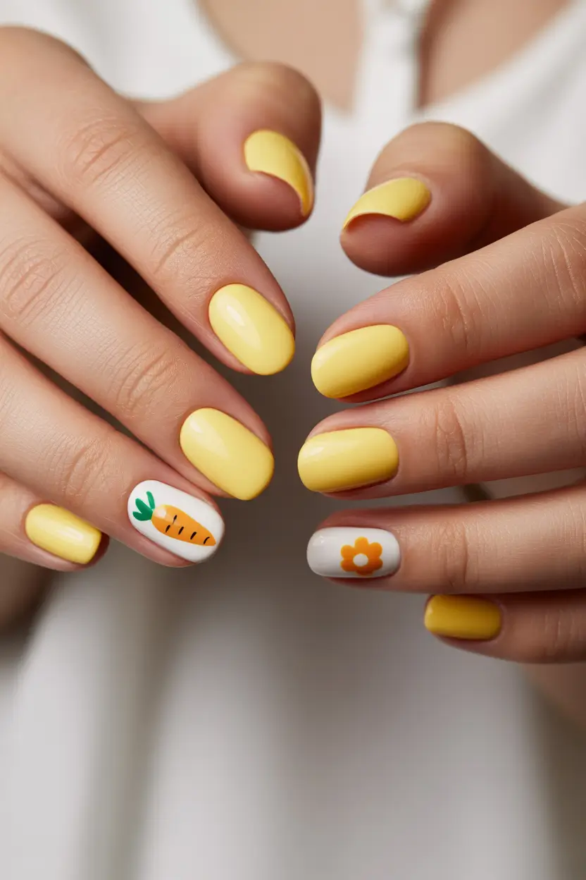
I usually go for pastel neon shades from brands like Essie or Lights Lacquer to keep that soft payoff. The tiny designs can be done with dotting tools and micro brushes – nothing too complicated, which makes it perfect if you’re just getting into nail art.
What I like is how wearable this is. It’s playful, but still subtle enough for everyday. If you’re exploring Combos short, this is exactly the kind of design that works beautifully without needing length.
I’ve recommended this style to friends who wanted something “cute but not childish,” and it always lands right in that sweet spot.
Matte coral elegance with gold accents
Now this is where neon starts to feel refined. A soft Coral base with a velvety Matte finish instantly changes the mood – it’s less playful, more elevated. Then those thin gold lines add just enough detail to make it feel intentional.
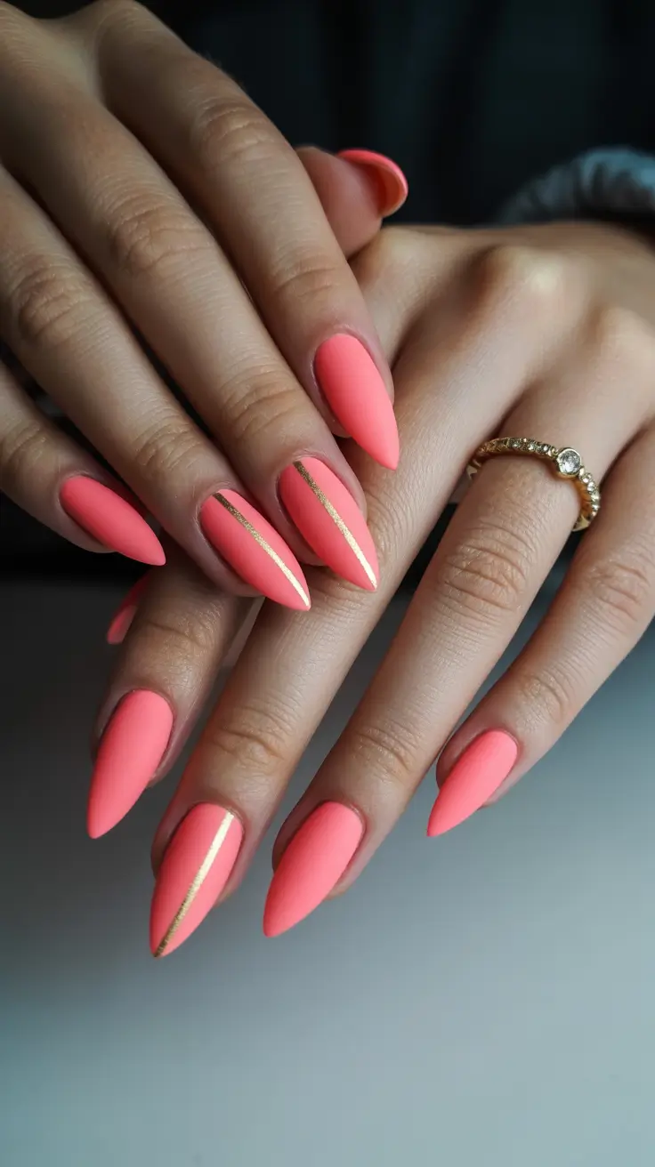
For this, I usually use a builder gel base and layer a coral shade from brands like The GelBottle or Bio Sculpture. The gold detailing can be achieved with striping tape or metallic gel liners.
Technique-wise, less is more. Keep the lines thin, slightly off-center – that’s what gives it that editorial feel. Nail artists often talk about “negative space tension,” and this is exactly that.
Personally, this is one of my go-to looks when I want something understated but still impactful. It feels grown, but not boring.
Neon mix with soft swirl accent
There’s something about mixing pink and yellow that just screams summer. Add a single swirl accent, and suddenly it becomes one of those playful Pink and orange-adjacent looks that feel effortless but styled.
I like to keep most nails Solid and let one or two carry the design. It creates balance without overwhelming the eye. For the swirl, I blend colors while they’re still wet, then refine with a thin brush.
This is also great if you’re experimenting with color but don’t want to fully commit to full-on art across every nail. It’s a soft entry into more expressive styles.
And honestly, this kind of manicure just feels happy. Like something you’d wear without overthinking.
Bold blue and green geometric neon mix
And then, just when you think you’ve seen every neon combination, this comes in. Electric blue paired with highlighter Green, sharp angles, and negative space – it’s bold, graphic, and undeniably modern.
I usually map out designs like this before applying color. A thin liner brush and patience are essential here. Brands like Kiara Sky have amazing neon pigments that really pop against neutral bases.
The beauty of this look is in the structure. Clean lines, intentional placement – it’s less about blending and more about precision. Definitely one of those Designs for when you want your nails to feel like part of your outfit.
And I have to say, this is the kind of set that makes you stand a little differently. More confident, a little sharper. You know what I mean?
Playful neon mix with graphic summer icons
This is the kind of manicure that feels like pure serotonin. Every nail carries its own little moment – a citrus slice in glowing Orange, soft blue with subtle Polka dots, a pink base with a heart. It’s a mix, but not chaotic. More like curated chaos, if that makes sense.
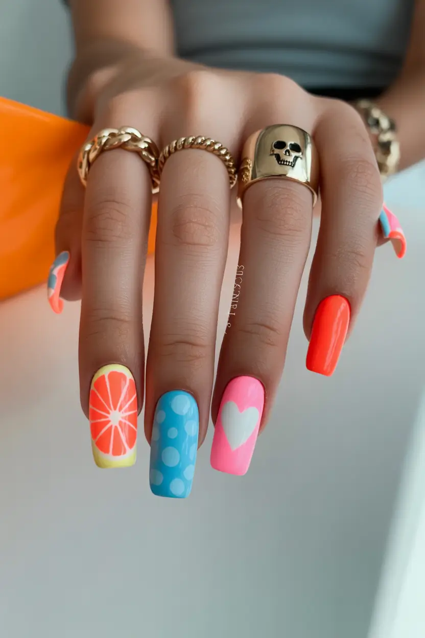
To recreate this, I usually treat each nail as its own idea. Neon gels from brands like ORLY or Cirque Colors work perfectly for that saturated payoff. The small details – especially fruit slices and dots – can be done with dotting tools and a fine brush.
What I love is how forgiving this style is. It doesn’t need symmetry or perfection. It’s one of those Art ideas simple that actually looks better when it feels a little spontaneous.
And honestly, this is the manicure I’d choose for a vacation. It’s fun, it’s expressive, and it never feels boring.
Neon graffiti mix with bold attitude
This one feels louder, more rebellious. A mix of acid Green, hot pink, black splatter, and graphic lettering turns this into something almost street-style inspired. It’s definitely one of those Acrylic bright sets that doesn’t try to be subtle.
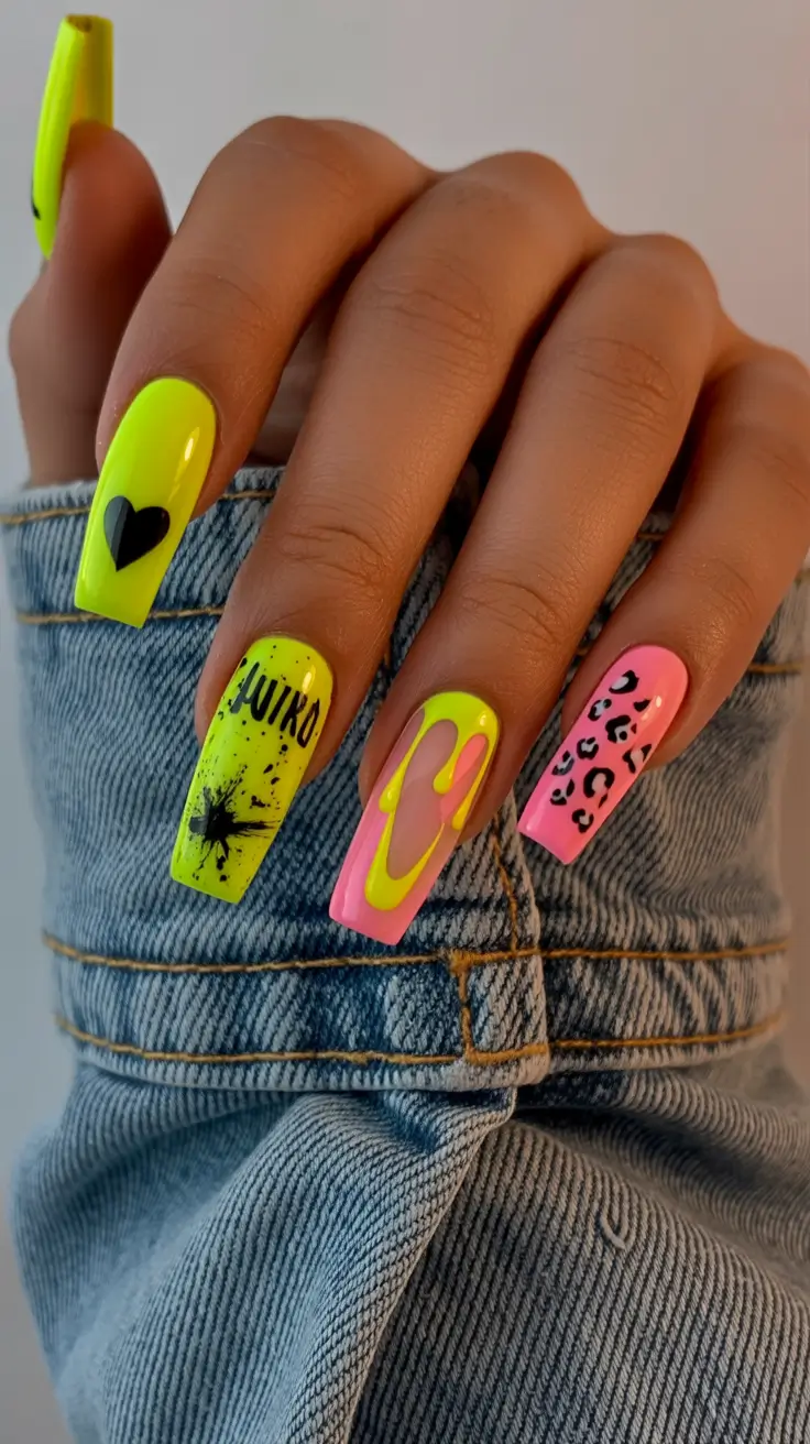
I usually build a base with neon gel polish, then layer in details using stamping plates or freehand techniques. The splatter effect can even be done with a stiff brush and diluted gel – it’s messy, but in a controlled way.
The key here is contrast and layering. You want each element to stand out without blending into each other. Nail artists often say to stop before it feels “too much” – and that’s exactly the balance here.
For me, this is a statement set. The kind you wear when you want your nails to say something before you even do.
Soft mint neon with delicate line art
And then, just when everything feels bold and loud, this comes in like a breath of fresh air. A soft Green-leaning mint paired with sheer nude and delicate white line work feels calm, almost minimal – but still very much part of the neon conversation.
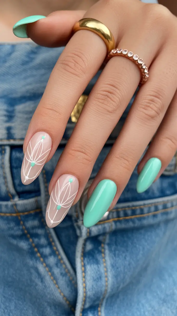
I usually start with a sheer base and add the mint color as a Solid accent. The line art requires a very fine brush and a steady hand, but the design itself is simple – just flowing lines and small dots.
What I’ve noticed is how versatile this look is. It fits into both casual and more polished settings. If you’ve ever felt like neon was too intense, this is your softer entry point.
Personally, I keep coming back to styles like this. They feel effortless, but still thoughtful – and sometimes, that’s exactly what you want.